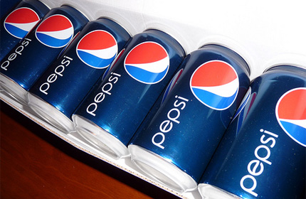
 A couple of months ago, I read an interesting article in BusinessWeek about Pepsi's new brand campaign. They're updating their logos to be fresh and modern and to connect with a new generation of young people. Blah, blah, blah--if you've heard it once, you've heard it a hundred times.
I'm rather skeptical of these redesigns to begin with. Assuming you aren't starting off with a crappy logo to begin with, does changing the logo really boost sales? According to sources, this rebranding project will cost Pepsi over one billion (that's with a B, folks!) dollars. Just to break even, Pepsi would have to generate at least one billion dollars more in revenue. This amazes me for two reasons:
1. Why the heck does changing a logo cost so friggin' much? I could have made something that I think looks better for a fraction of that cost. =)
2. Pepsi actually believes they'll make up that cost in increased revenues? Maybe they're right, but I find that hard to swallow.
 Looking at some of the historical images of Pepsi logos, I can understand why some of those first designs were redesigned. They're hard to read, look a lot like the Coca-Cola logo, and look pretty boring with just red text on a white background.
One thing you'll notice, however, is that the logos get progressively more complicated. That 2005 logo is positively busting at the seems. The new "in" thing now is to go simple. Compare it to the newest Pepsi logo. My first thought when I saw it was, "Ugh. That's hideous!"
The BusinessWeek article I read explained the rational--the "in" thing nowadays is simple and sleek, like the iPhone. I suppose that makes sense on a superficial level, but really, would you bet more than a billion dollars because someone is trying to compare a carbonated beverage to the iPhone?
I'll be the first to say that iPhones and iPods are slick. They're simple, they're sleek, and they look just plain cool. It works for electronics, however, because electronics--historically--have been large, complicated, and expensive. A "laptop" ten years ago probably weighed 20 pounds. They have holes to plug in a wide variety of things--keyboards, mice, speakers, USB drives, microphones, printers, monitors, power cabels, cameras, yadda, yadda, yadda. Wires that have to be color coded because it's too complicated to figure out otherwise.
When someone can develop a technology that's so incredibly simple and elegant, so incredibly small and cheap, it's slick. It's freakin' cool. It makes people's eyes bug out and pull out their wallets, like a moth to a flame.
This is carbonated beverages we're talking about, though. They can slap a simple logo on the product, but the product has not changed. I don't see the new Pepsi logo and think, "Wow, that Pepsi is so friggen awesome!" It's still just a soda. The lipstick on a pig anology comes to mind.
What works to sell electronic devices, therefore, I don't necessarily think will help sell other types of products. The "wow" factor just isn't there.
Even worse, look at that new logo. Starting in the 1990s, the logos started looking more 3-dimentional. More complicated. They're taking a simple product--one of the simpliest that most people are likely to buy on any given day--and trying to sell it as more than it really is. It's an "experience." They're trying to dress up their product to make it look more sophisticated than it really is. Logically, that makes a lot of sense to me, so long as they don't go too far overboard with that concept. That last logo of 2005 makes me thing they may have pushed that concept a bit too far, but it could have been worse.
This newest logo, however, comes right out of the 1970s. It's 2-dimentional. You know another word for 2-dimentional? Flat. It looks flat. And really, if you're in the business of selling carbonated beverages, is that really the look you want to go for? Flat?
I rest my case. The new Pepsi logo sucks.
